- My role
- Product Designer - Freelance
- Timeline
- Q3 2023
- Company stage
- Scale-up (Series F)
- Team
- Product Manager, UX Researcher, Data Analyst, Product Designers (2), Engineering team (6)
Context
GetYourGuide is a travel platform where booking decisions hinge on what other travelers say. Reviews sit at the center of that: they’re what turns a browsing session into a booking. But the review experience hadn’t kept pace with the rest of the product, and the team had made closing that gap the next priority.
Reviews had lost their relevance
Many reviews described experiences from years ago. For users trying to decide whether to book today, that gap was hard to ignore. In a platform built on trust, stale content doesn’t just fail to convert: it actively creates doubt.
Participation was dropping off
A star rating and a text box weren’t enough to get people writing. The effort felt disproportionate to the impact, so fewer travelers bothered. Without a steady flow of fresh contributions, the whole system lost credibility over time.
What the data told us
User behavior showed two distinct patterns. Contributors shared detailed accounts with context and tips. Evaluators rated quickly and moved on. On the content side, the reviews that performed best were recent (submitted within 90 days), concise (under 300 characters), and honest enough to cover both positives and negatives. From a business perspective, contributors drove the most engagement, but designing only for them would leave volume on the table. The solution needed to work for both.
Framing
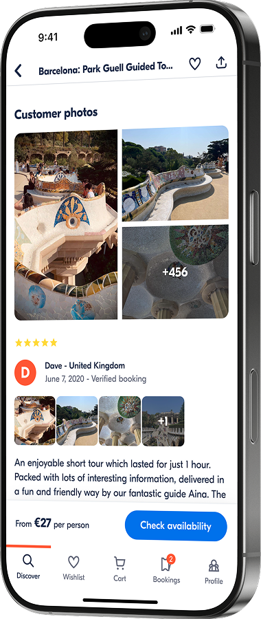
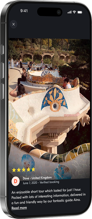
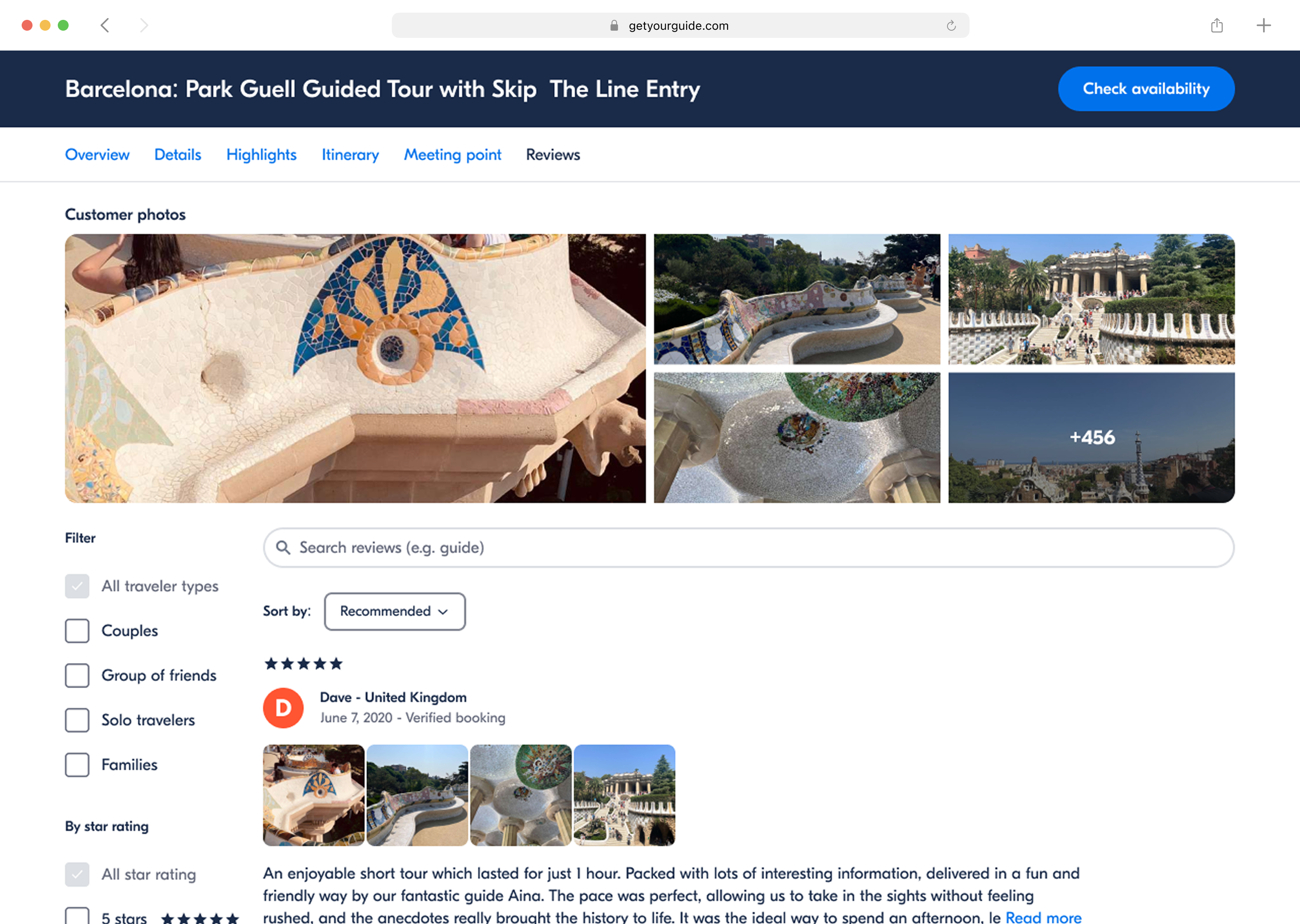
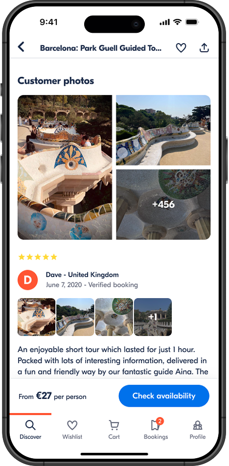
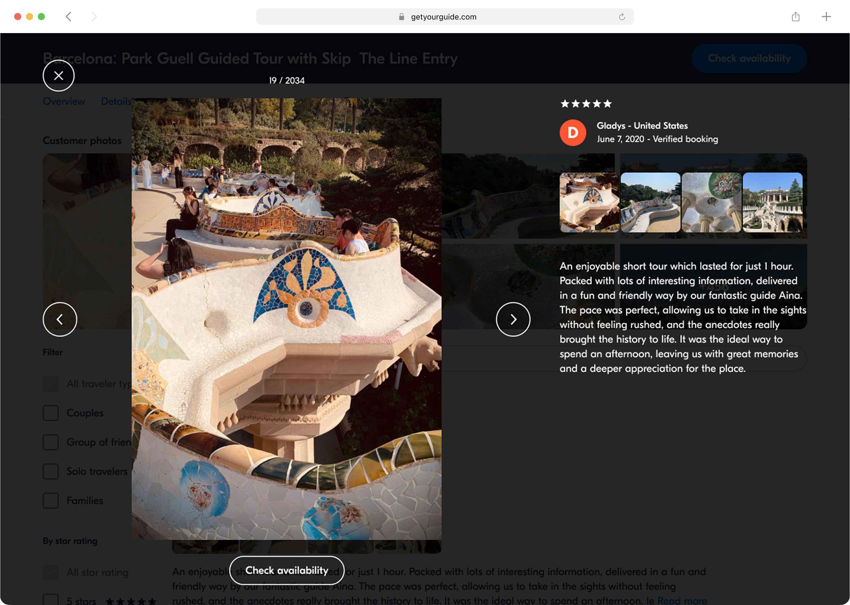
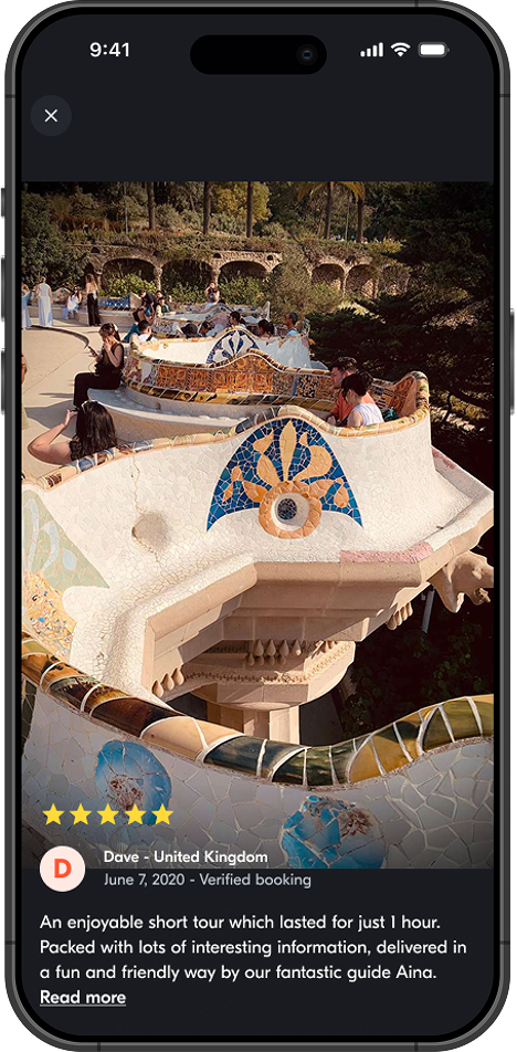
The opportunity was in the format. Make photos the centerpiece on both sides: a richer submission flow for contributors, and a more visual, browsable display for travelers making booking decisions. Success meant two things: more travelers following through on leaving a review, and those reviews doing enough work on the activity page to move people closer to booking.
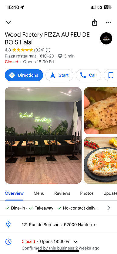
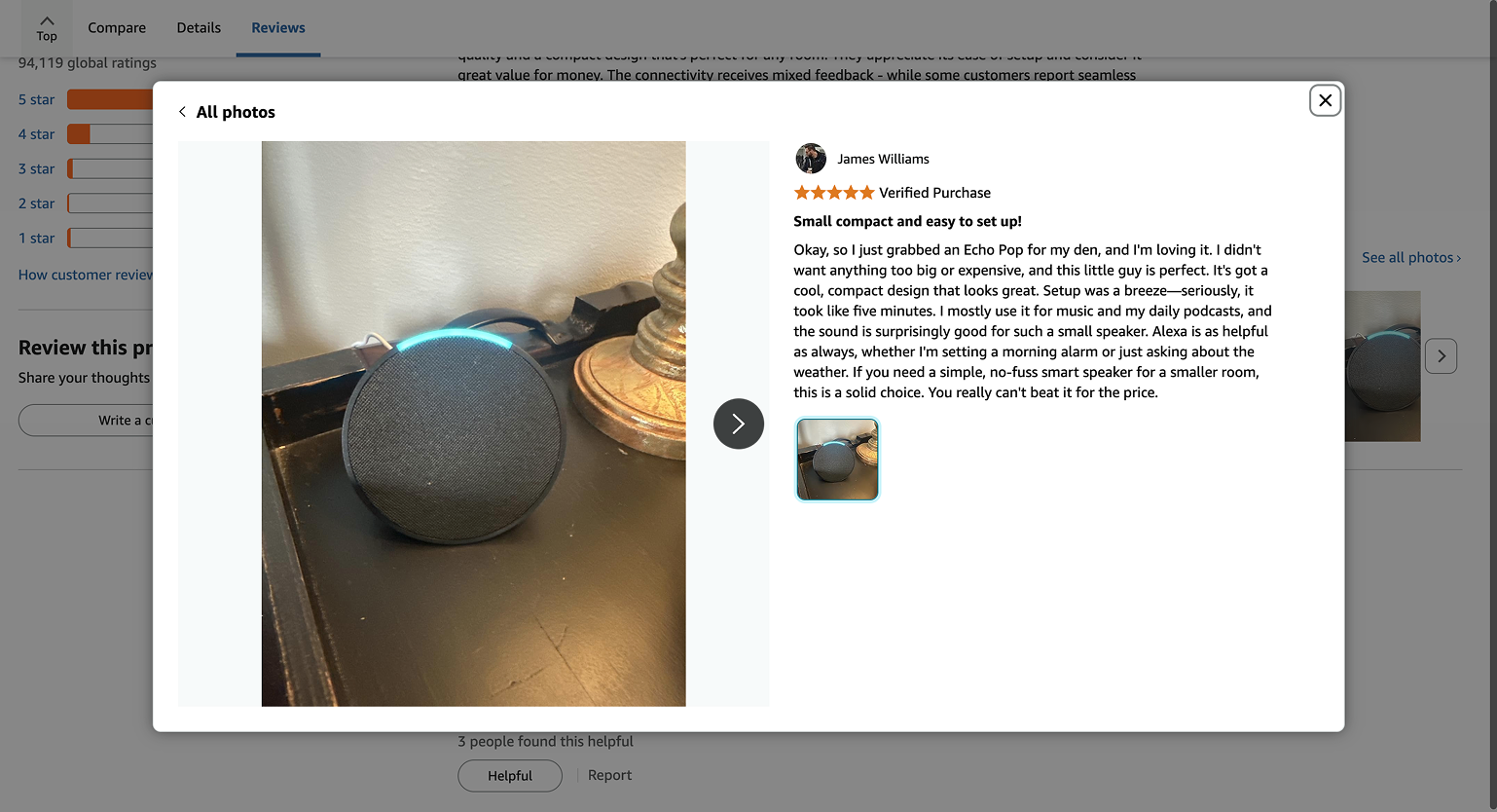
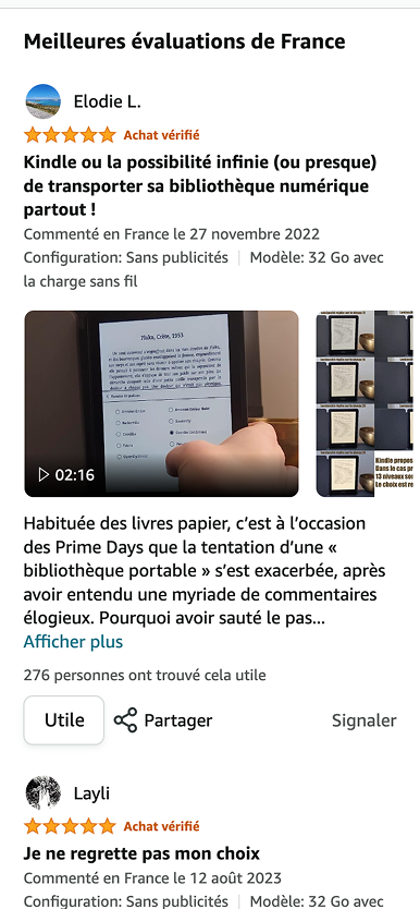
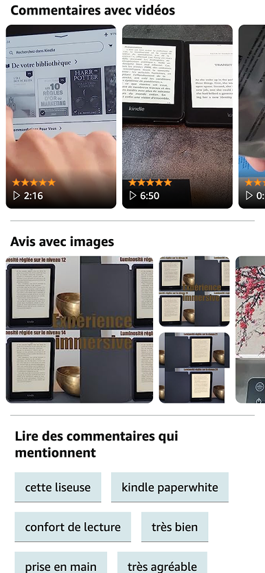
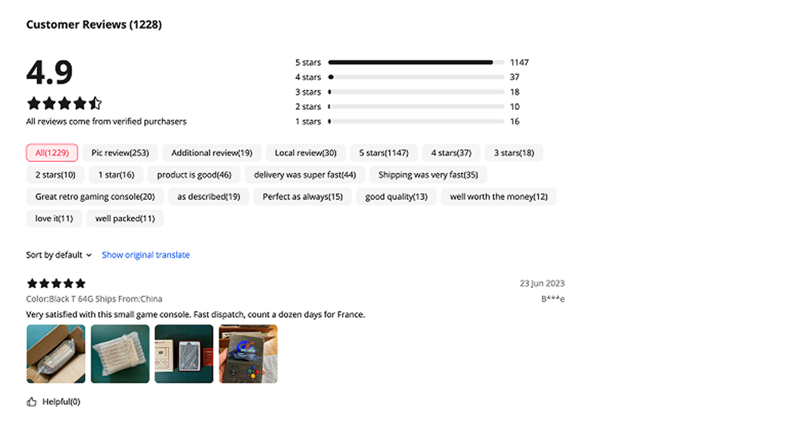
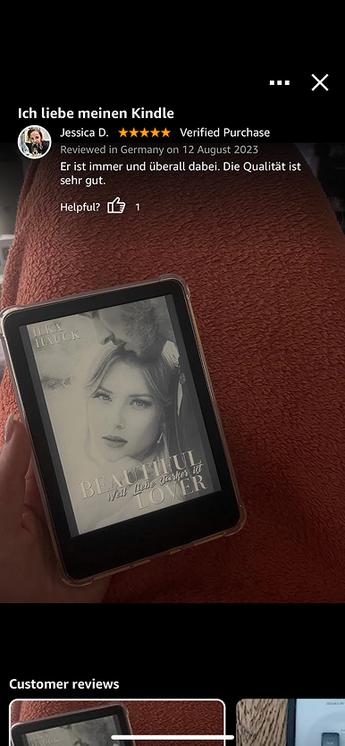
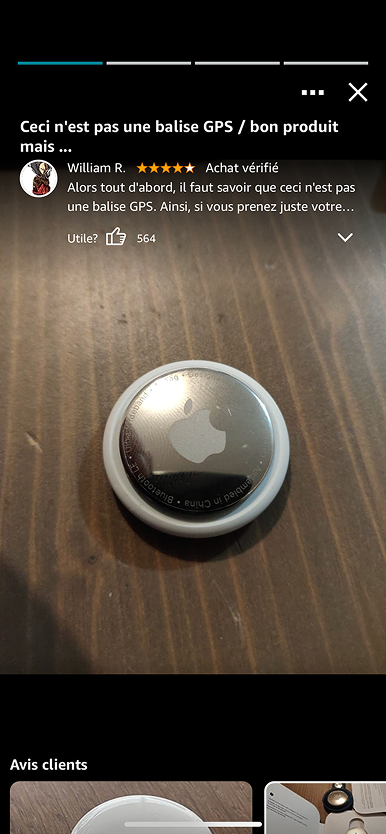
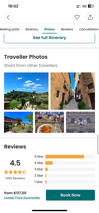
Photos in reviews: a highly engaging, low-effort way to capture experiences
With two designers on the team, we split the work. My colleague focused on the submission flow, I focused on how photo-rich reviews would be displayed and browsed across platforms.
Step 1: Understanding the landscape
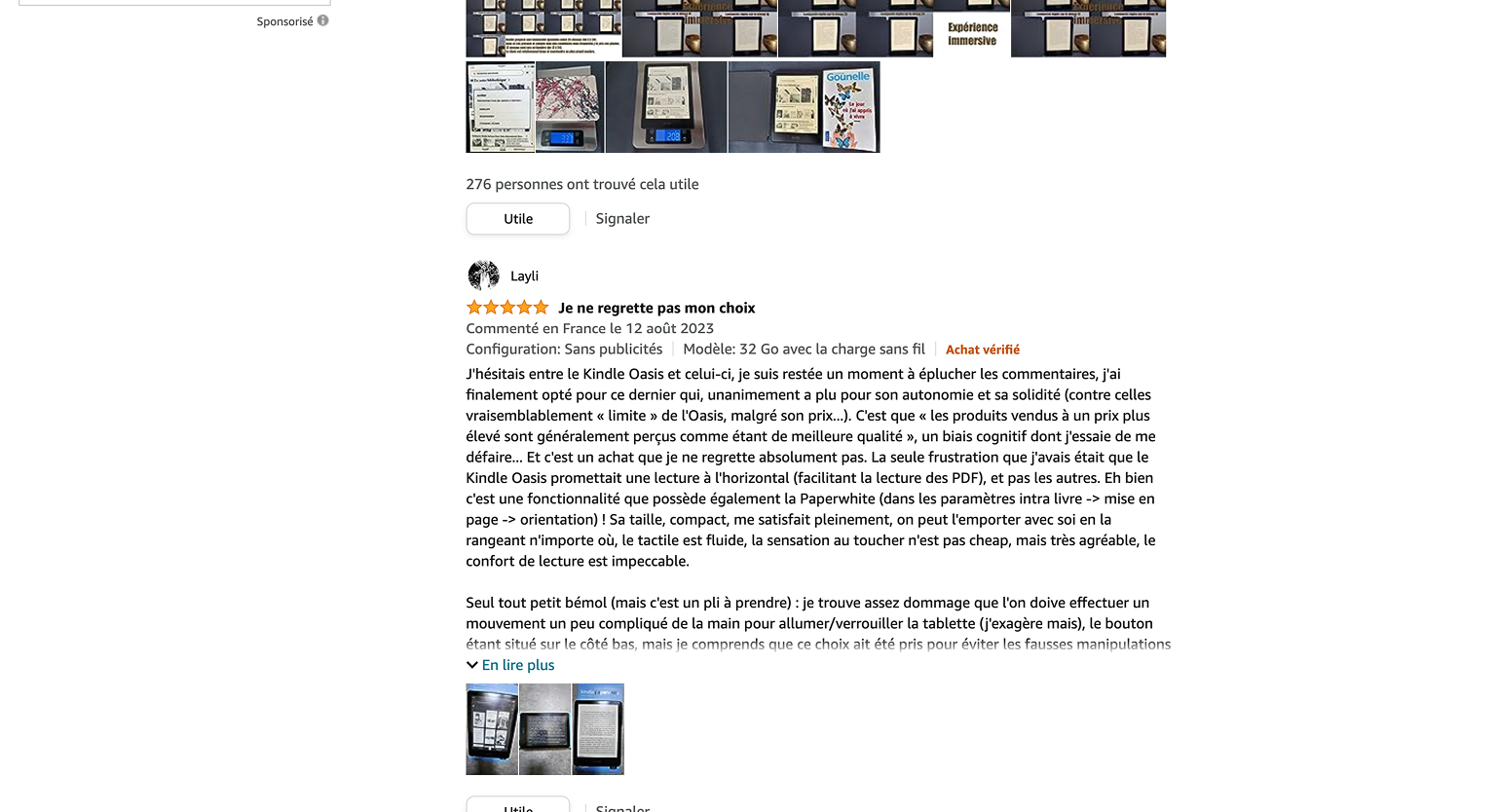
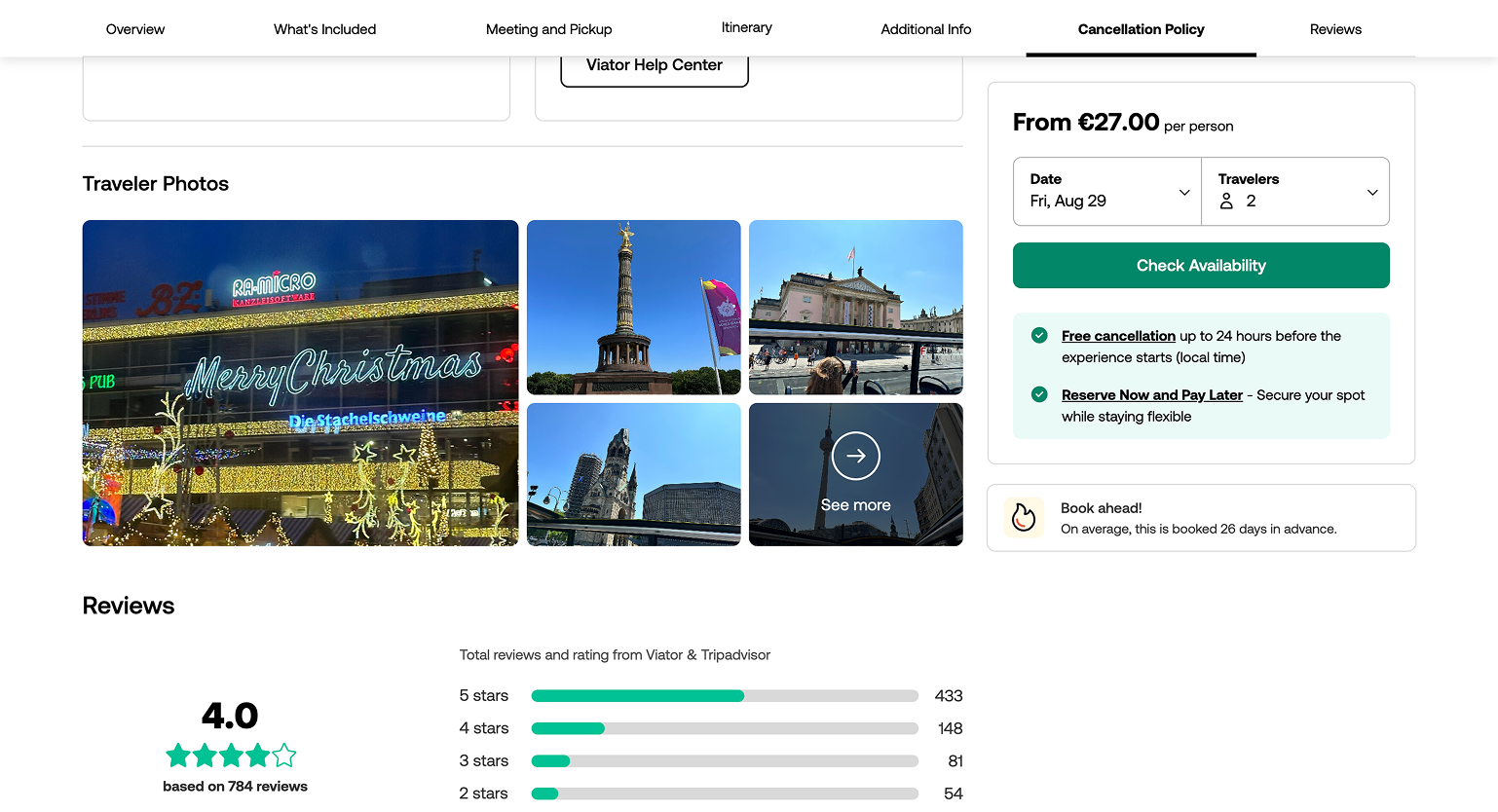
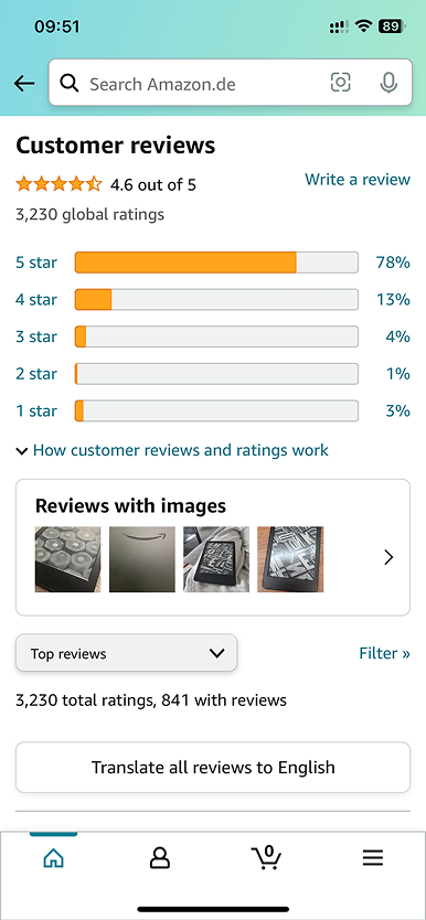
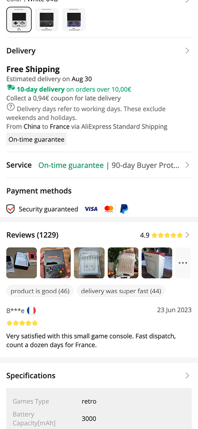
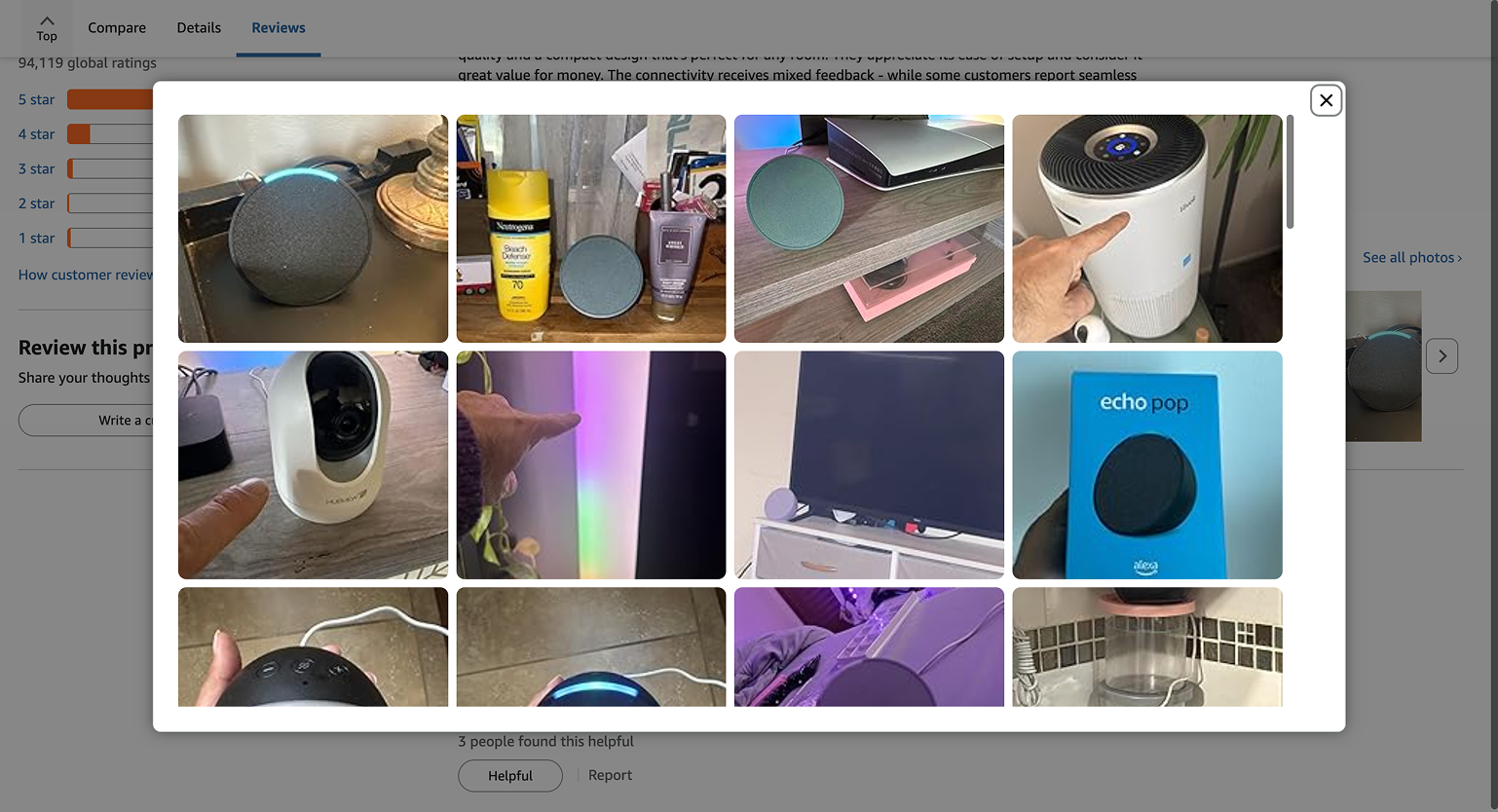
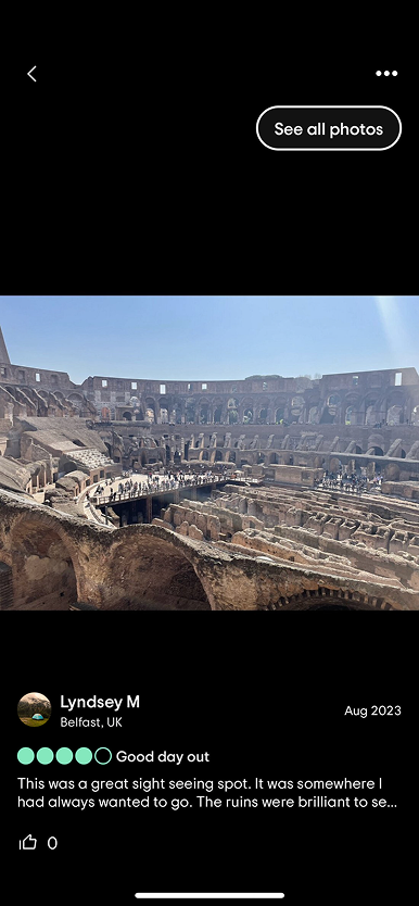
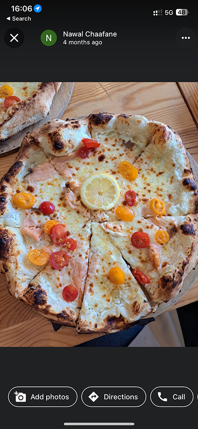
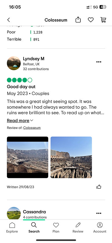
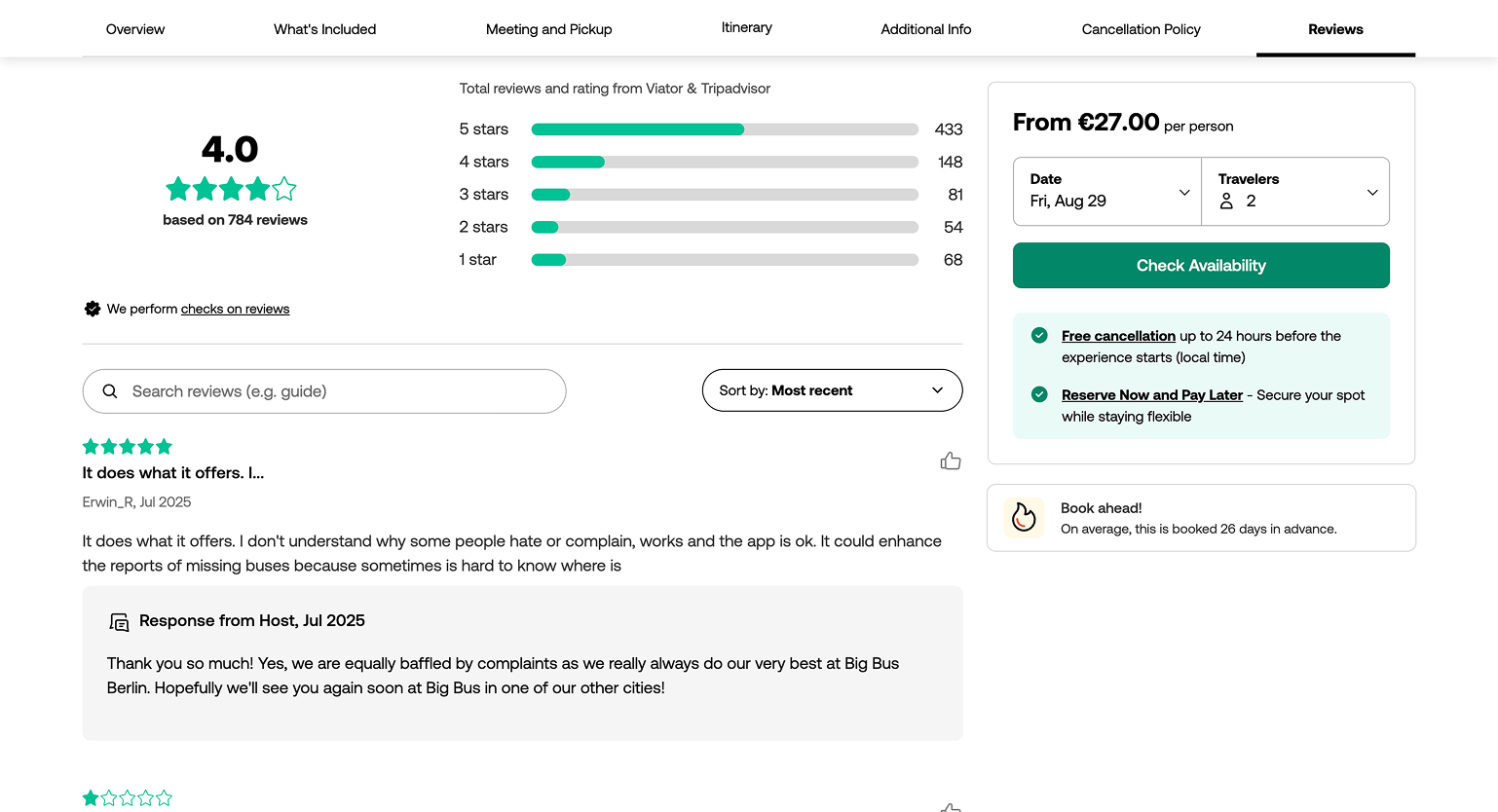
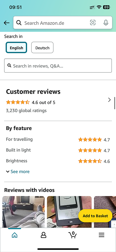
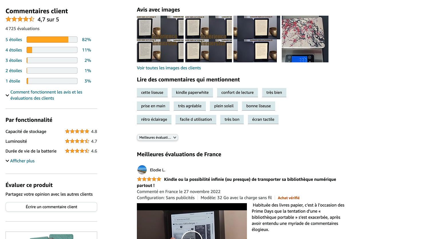
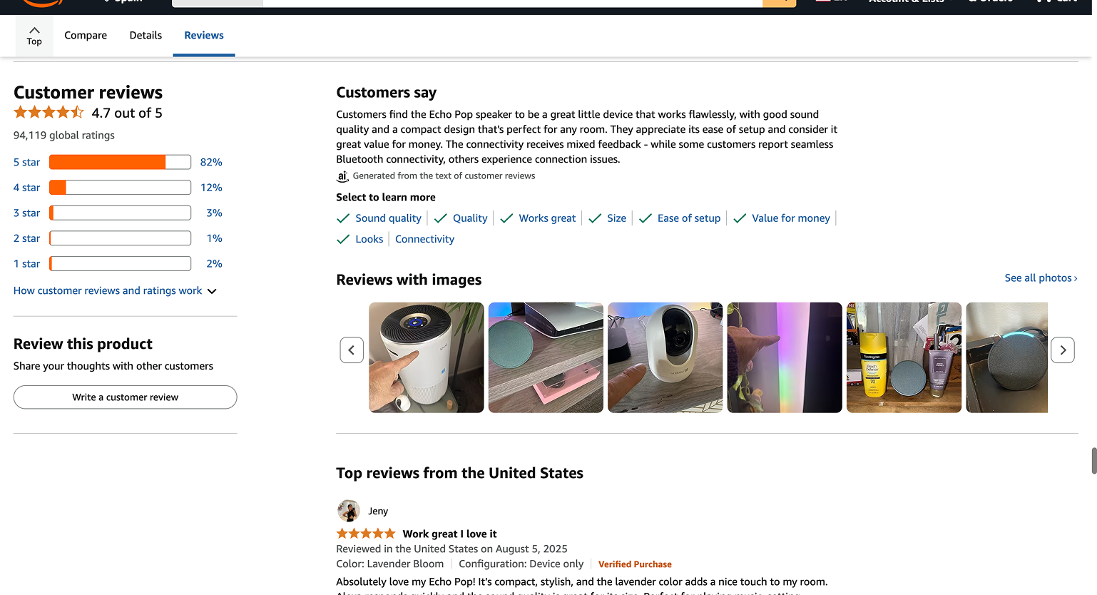
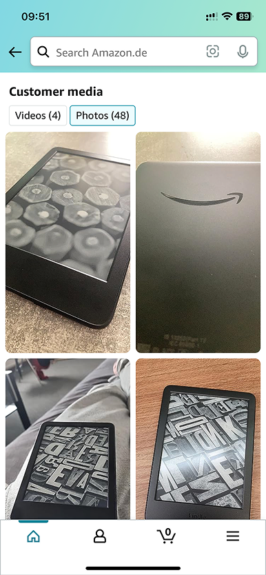
Reviews with photos aren’t a new concept. Before designing anything, I ran a competitive benchmark across direct and indirect players to identify what already worked and why. The goal wasn’t to copy but to understand user expectations well enough to know where we had room to differentiate and where following convention was the right call.